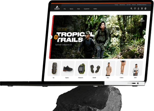
Improving Online Store Website for the biggest outdoor gear brand in Indonesia
Client
Eiger Adventure
Early 2021 - Late 2023
Role
UI/UX Designer
Responsive Website Design
Visual Design
UI Kit
About Company
Founded in 1979, Eiger Adventure is one of the largest apparel, footwear and accessories companies in Indonesia. Eiger Adventure has a large ecosystem with 2500 employees, 152 stores.
Background
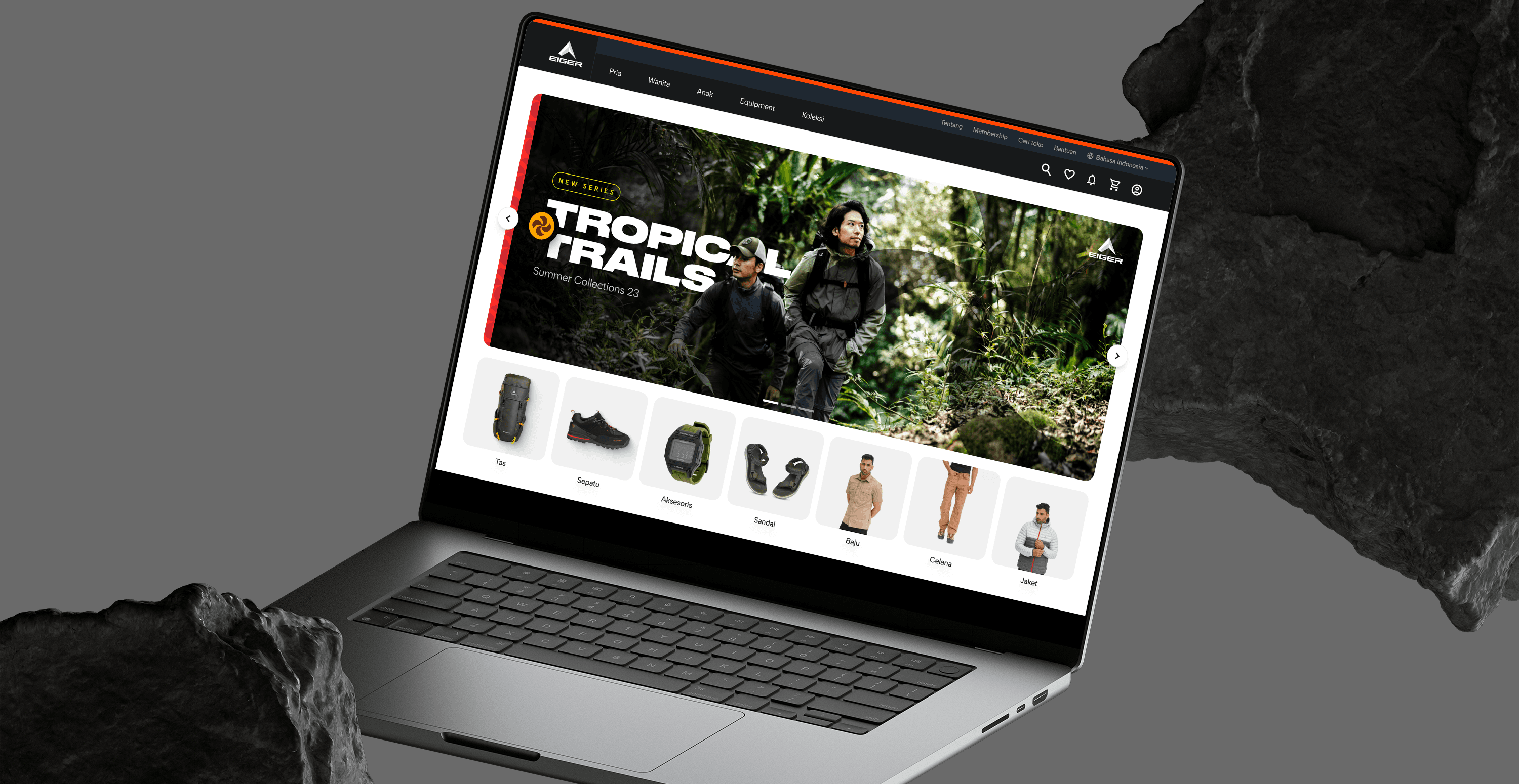
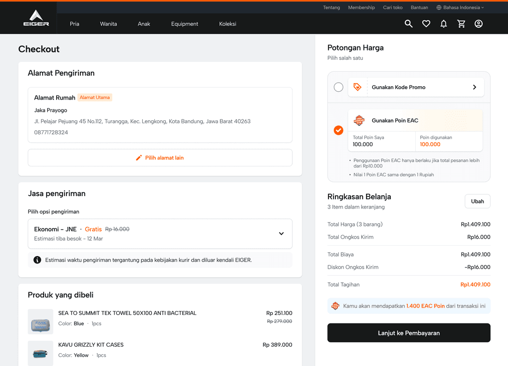
Eiger's ecommerce website is one of the company's largest sales channels. Since the COVID-19 pandemic in 2020, online sales through this channel have increased. Therefore it is necessary to revamp the e-commerce website to improve user experience
PROBLEMS
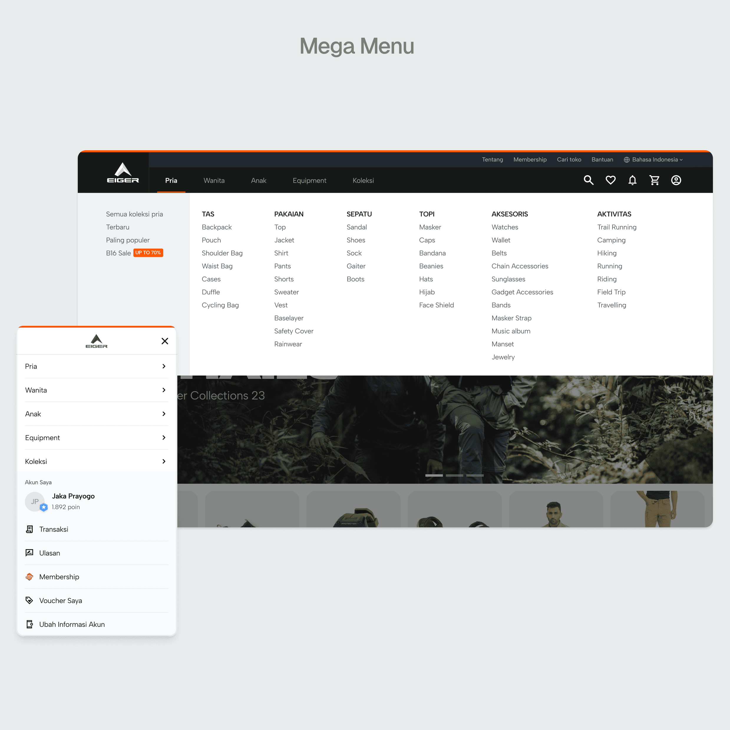
While Eiger Adventure's online store enjoyed significant website traffic, our research revealed a concerning trend; users struggled to find products due to confusing navigation, limited perceived product selection, and a lack of visual clarity.
MAIN OBJECTIVE
HOMEPAGE
PROBLEM
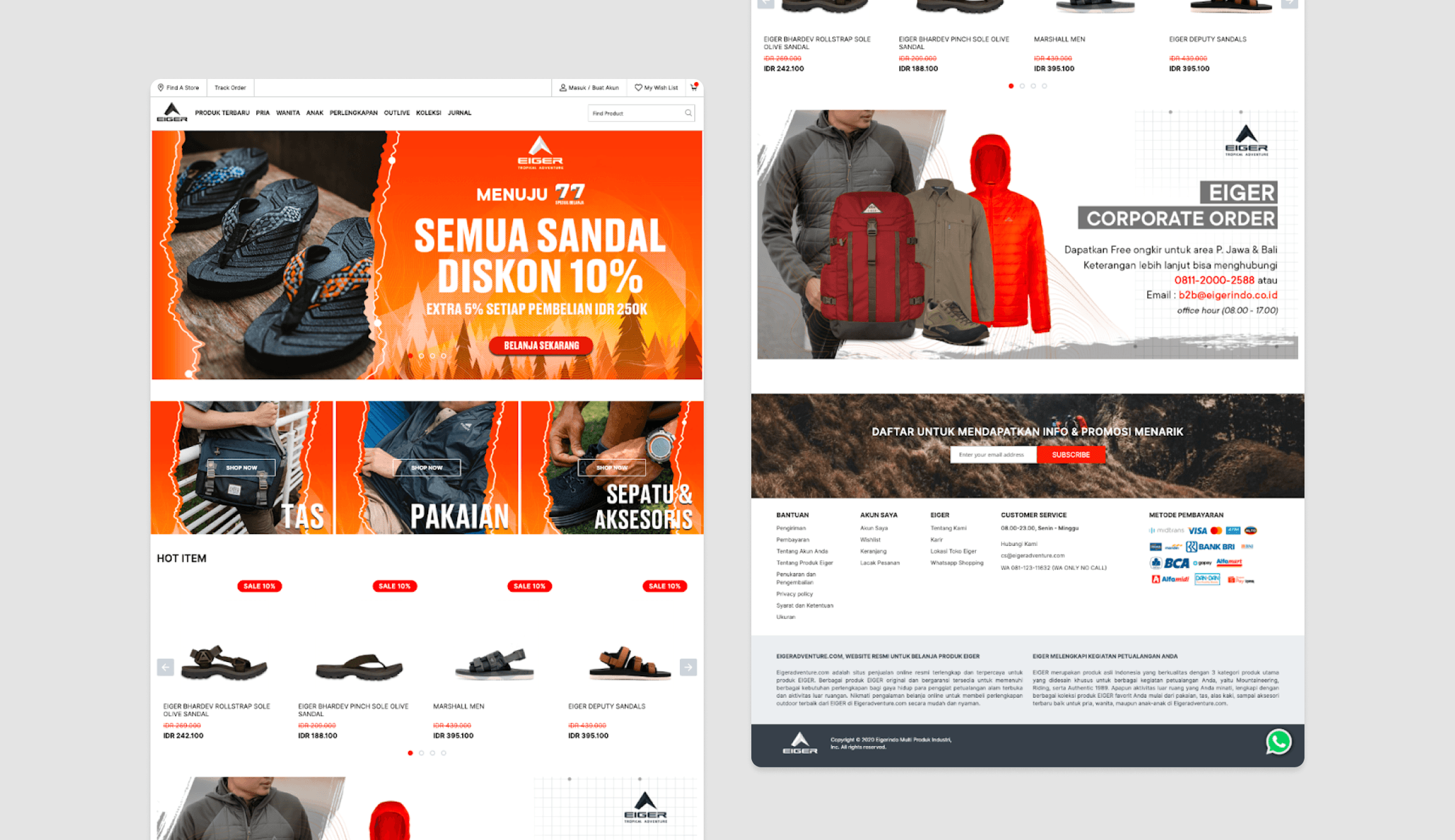
The previous homepage design was limited in its ability to engage window shoppers and showcase the full scope of Eiger Adventure's product range. This led to users browsing a limited set of products before leaving the website, resulting in low product page views.
SOLUTION
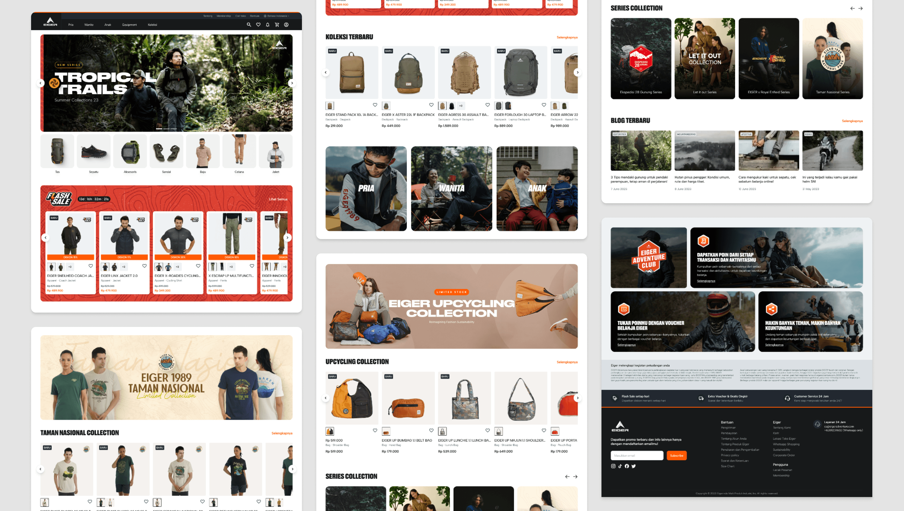
The redesigned homepage incorporates various sections:
01.
Flash sale section
Catches attention with limited-time offers, encouraging exploration.
02.
Category by activities
Makes it easier for users to discover products based on their intended activity (e.g., hiking, camping, etc.)
03.
Highlighted collections
Showcases curated product sets, introducing users to new offerings.
05.
Collaboration collections
Features partnerships with other brands or notable figures, fostering user interest.
06.
List of product series
Provides a comprehensive overview of product lines, encouraging deeper exploration.
By adding these sections, the homepage enhances the browsing experience for window shoppers and increases the likelihood of users discovering relevant products, ultimately leading to increased product page views and engagement.
Before: Displaying only few sections
After: Added various Sections
PRODUCT LISTING PAGE
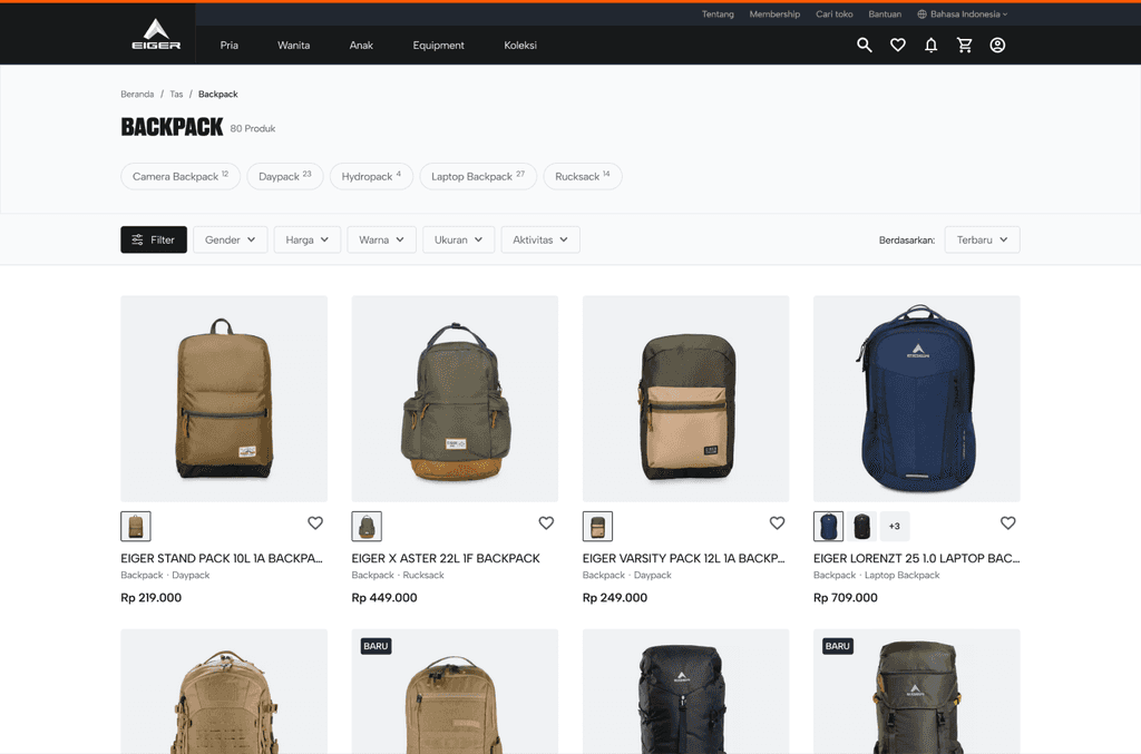
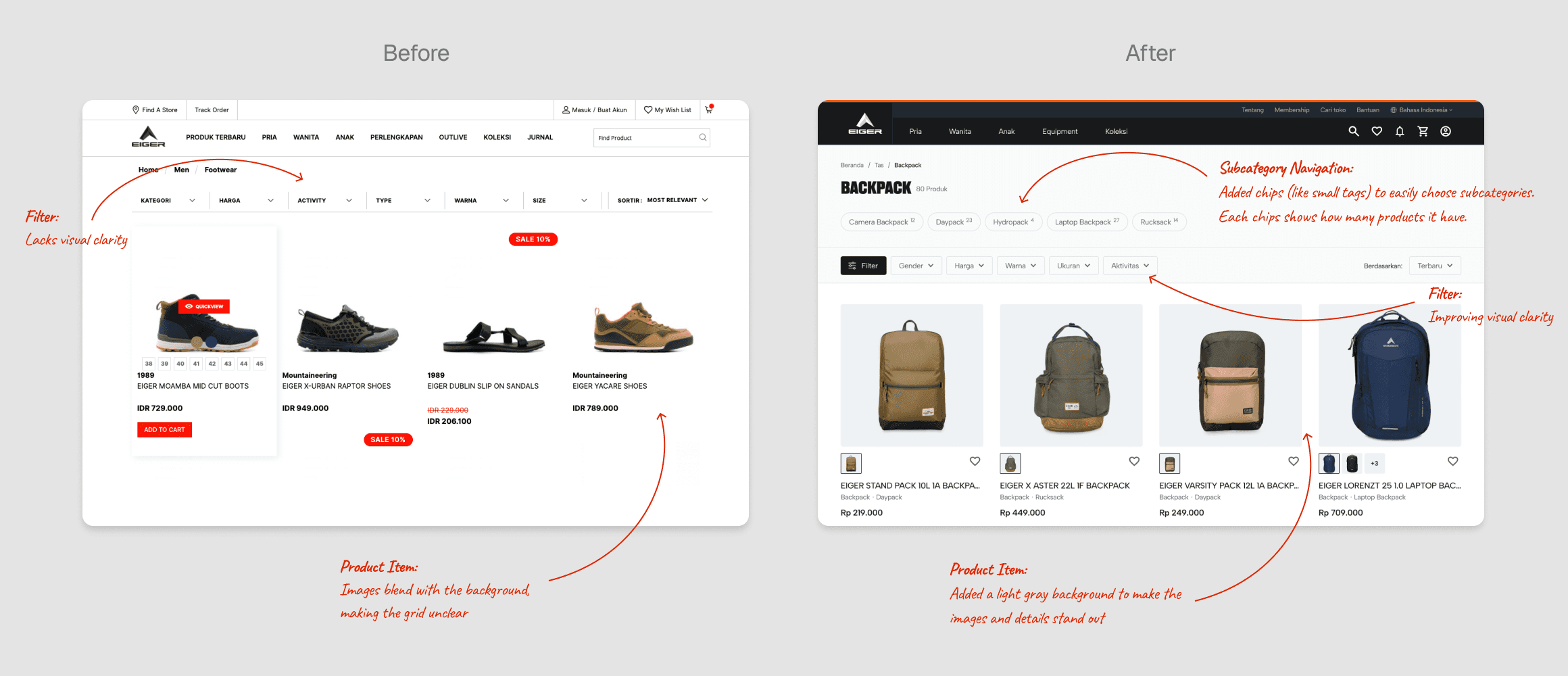
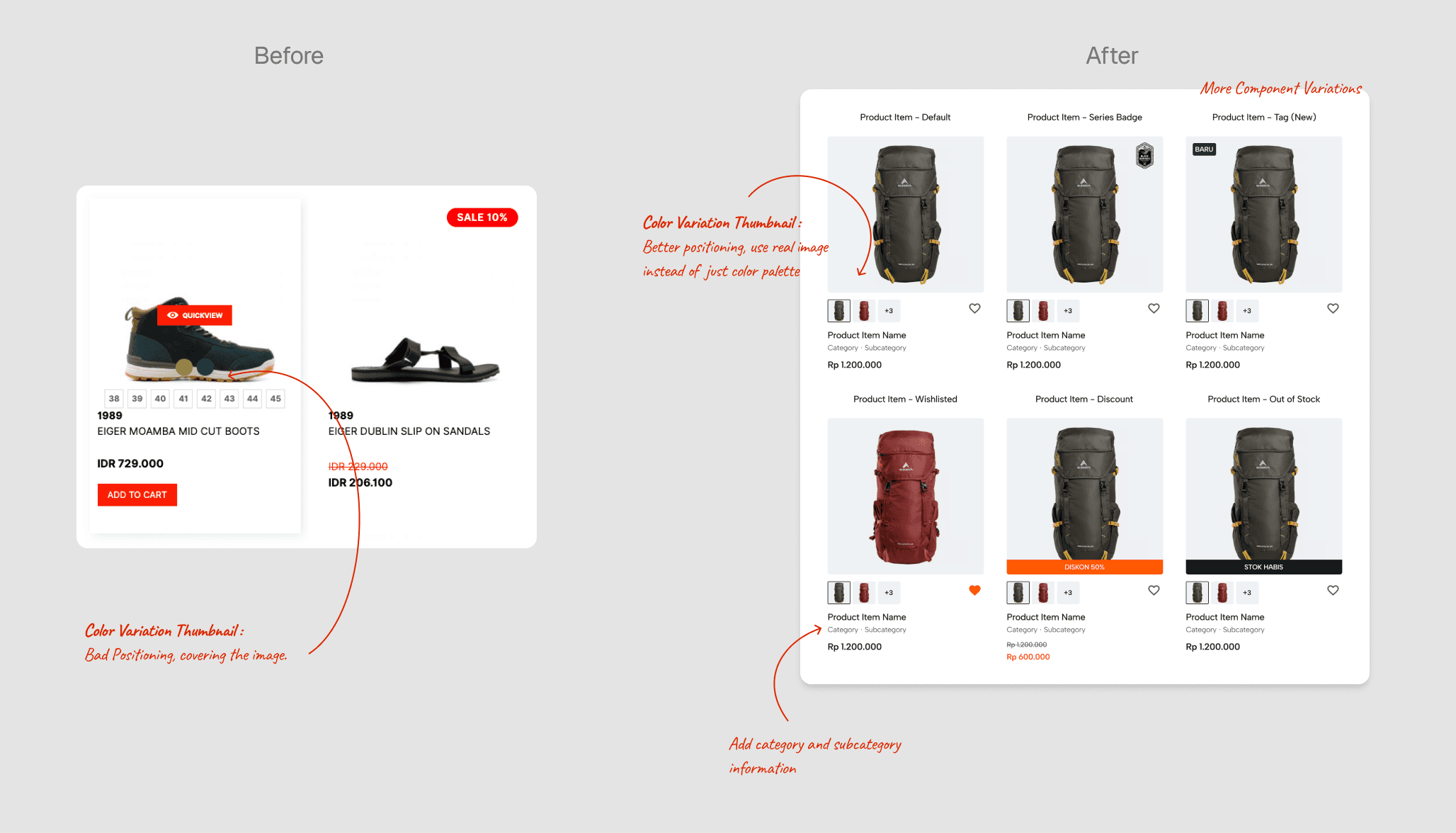
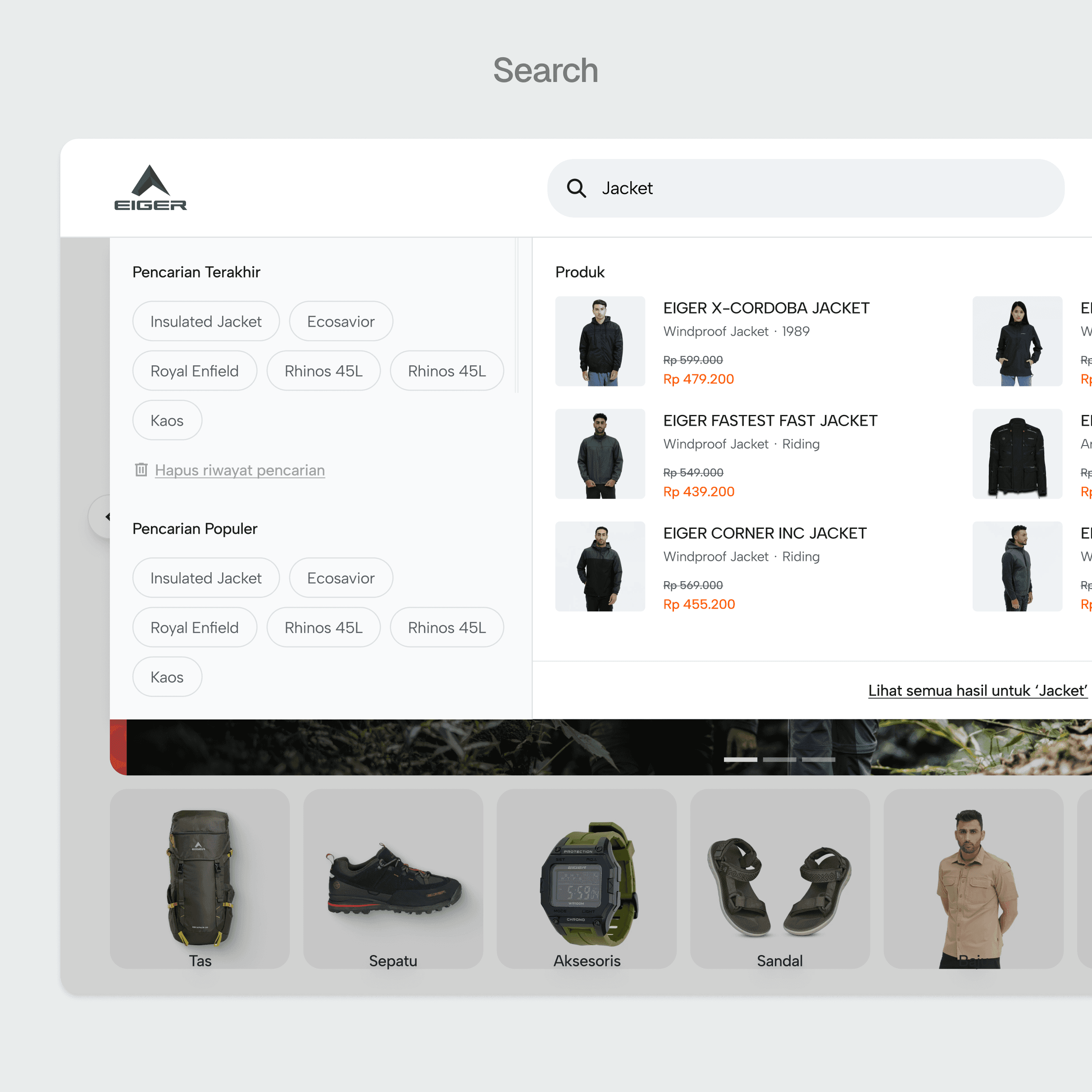
Enhanced filtering functionalities on the product listing page empower users to refine their search based on specific needs and preferences, leading to faster product discovery.
PRODUCT DETAIL PAGE
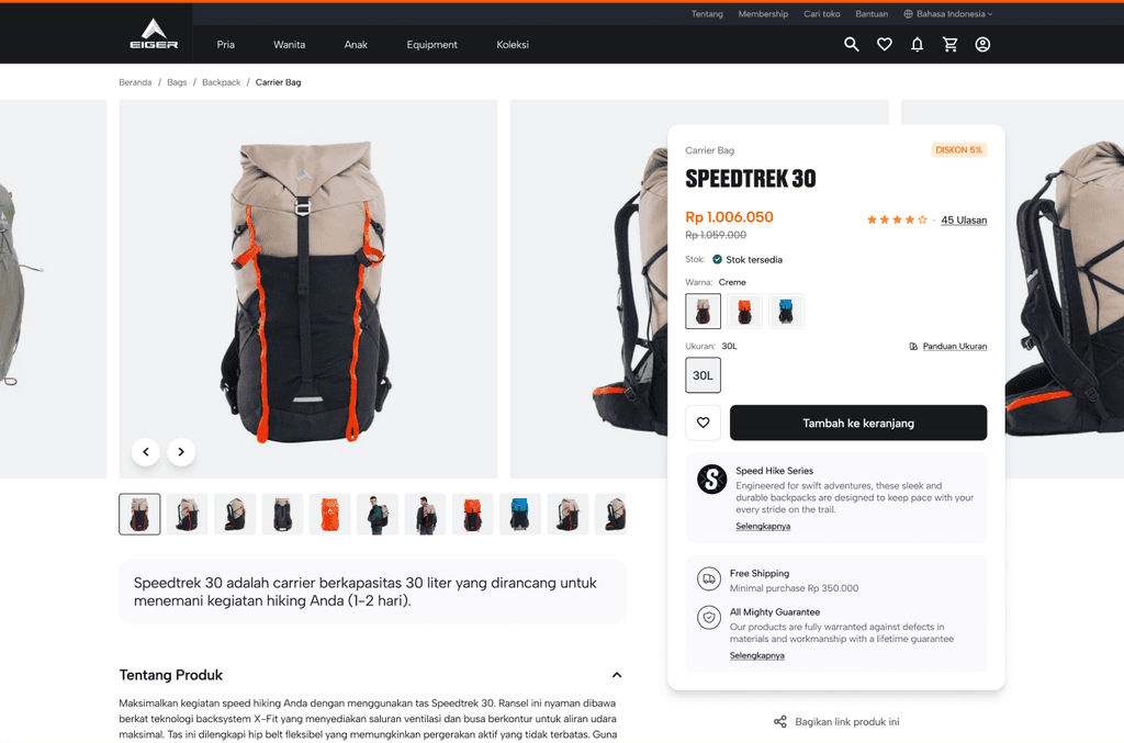
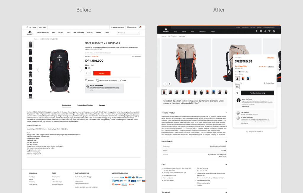
The revamped product detail page showcases detailed product information alongside high-quality visuals, fostering user engagement and informed purchase decisions.
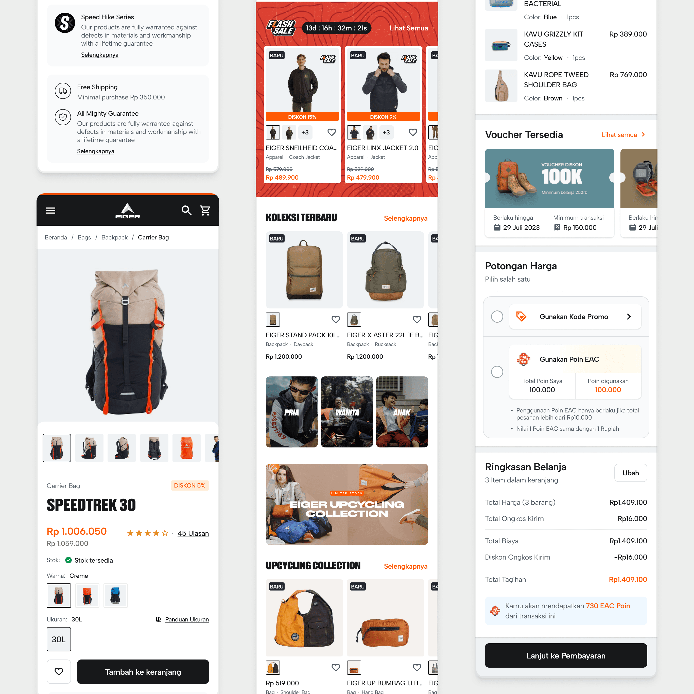
MOBILE RESPONSIVE DESIGN
The website was redesigned to be fully responsive, adapting seamlessly to various screen sizes, including smartphones and tablets. This ensures an optimal user experience for all users, regardless of their device, and encourages easy product discovery on the go.
